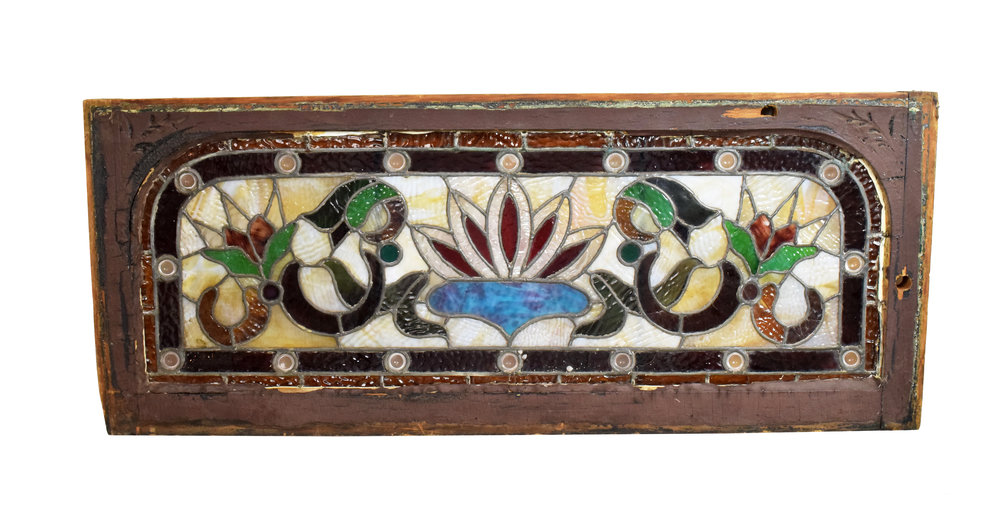
Integrating Stained Glass Into Interiors
/Stained glass began bringing color and light to interior spaces in 7th century AD, and continues to inspire designs to this day. Regardless of interior style, it has been repeatedly used as a focal point, or as a complement to its surrounding decor.
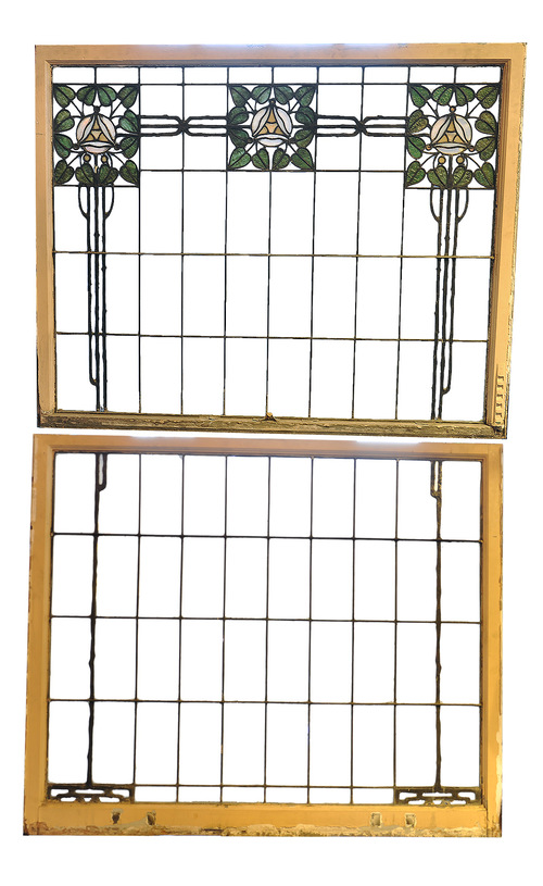
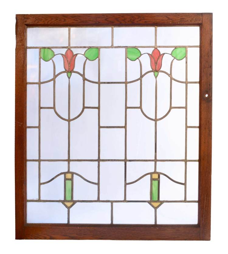
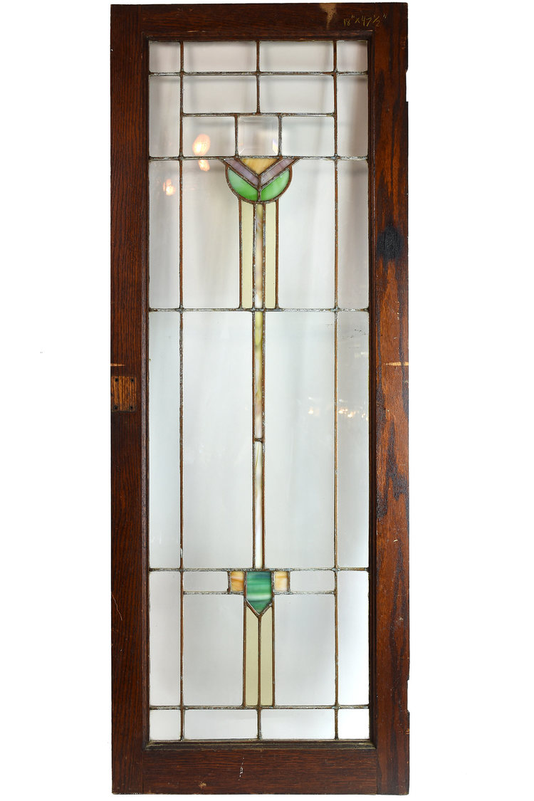
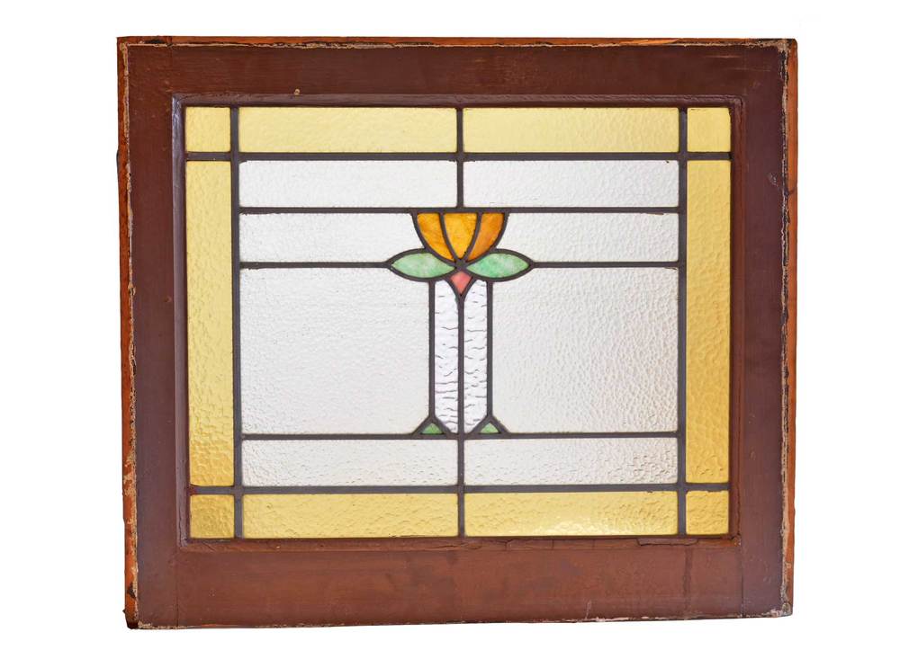
Integrating stained glass into interiors doesn't have to be challenging, but it often appears that way. There is the daunting task of finding a piece that works with your desired color scheme, and of course deciding on a location where the piece will shine – literally and figuratively.
In order to aid you in your stained glass design journey, we have found spaces that effectively added visual interest through stained glass. Check out these three vignettes that prove that any design can benefit from stained glass.
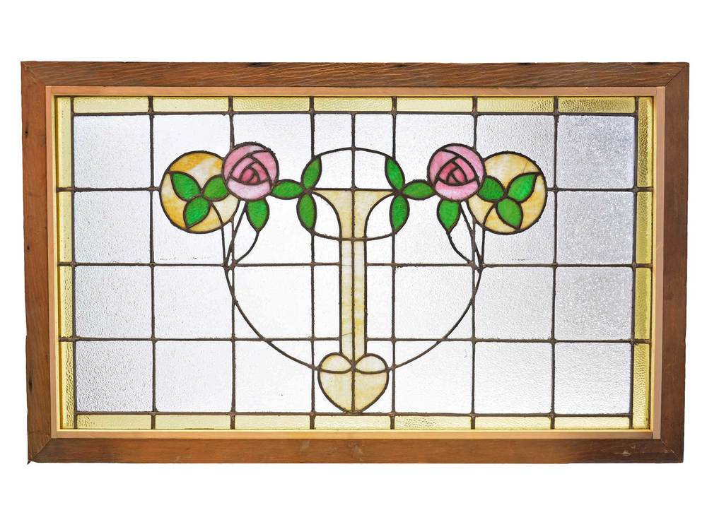
Traditional
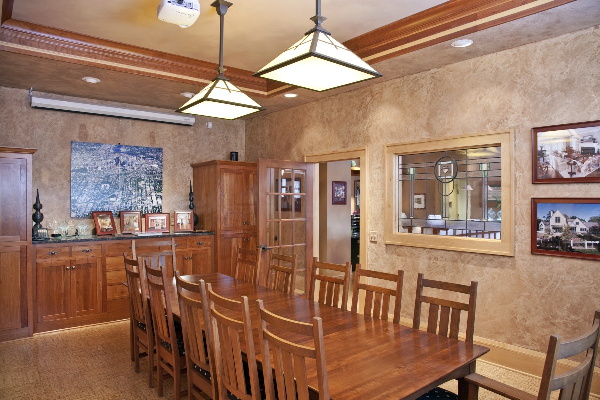
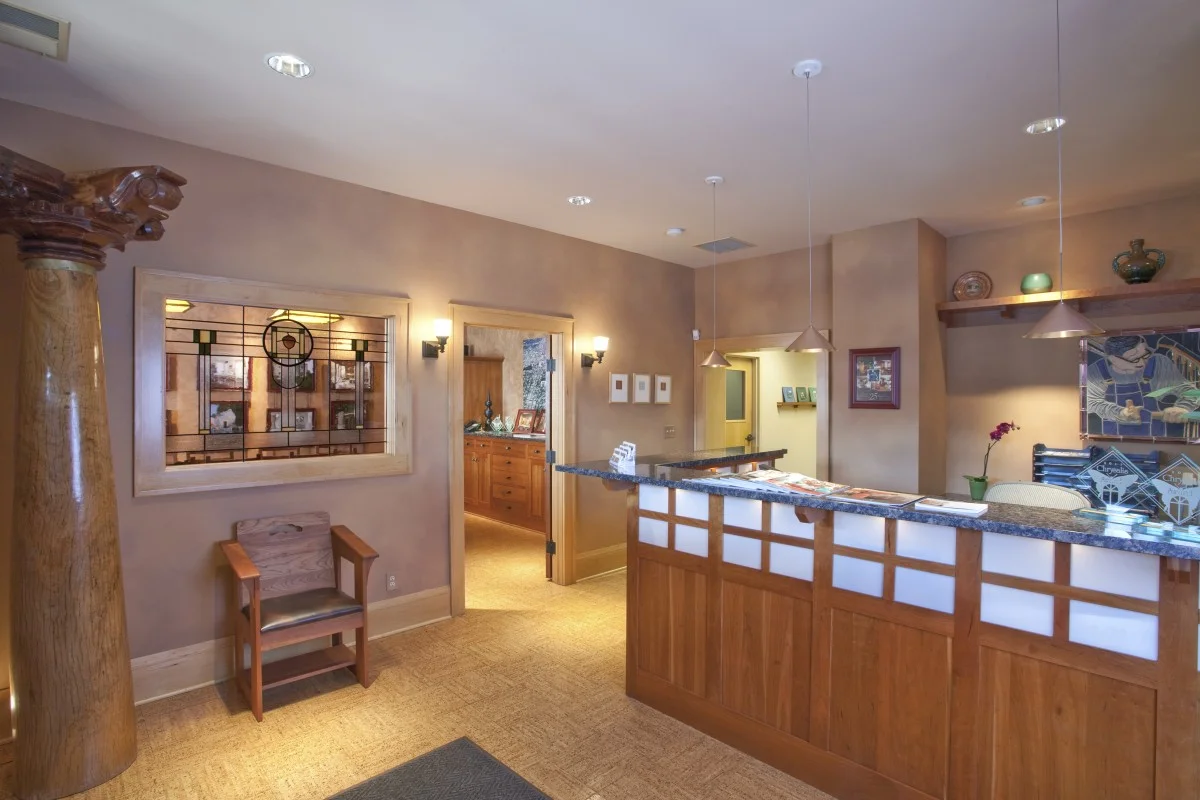
The office of TreHus, an architecture and interior design firm, shows how a stained glass window allows a craftsman-inspired space to stay true to its style, while adding interest and function. The green tones in the window complement the cherry wood used throughout the space, while also adding depth to the neutral color palette. Additionally, the window allows sightlines between the conference room and lobby, without compromising privacy.
Traditional-Modern
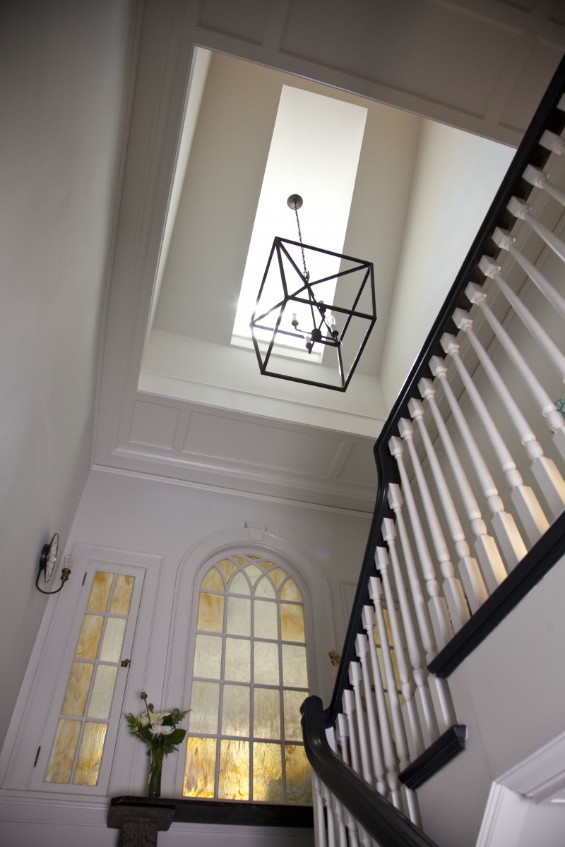
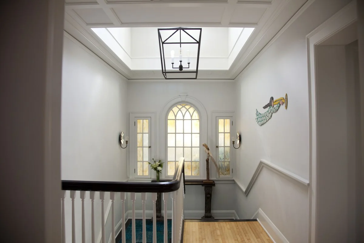
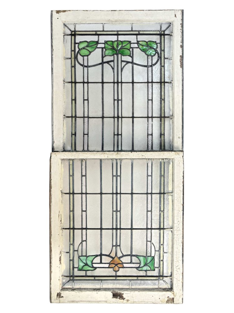
This stairwell combines traditional architecture with a modern color scheme and materials. The gold and muted mint stained glass windows reinforce the traditional architecture, as well as repeating the colors in the flooring and the white trim. This particular integration of stained glass subtly ties together the differing aspects of the design, while still letting light into the space.
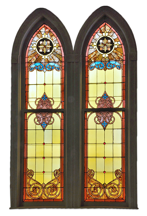
Modern
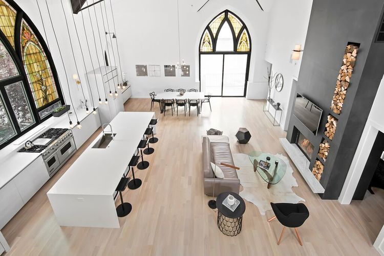
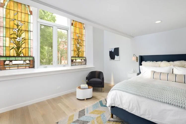

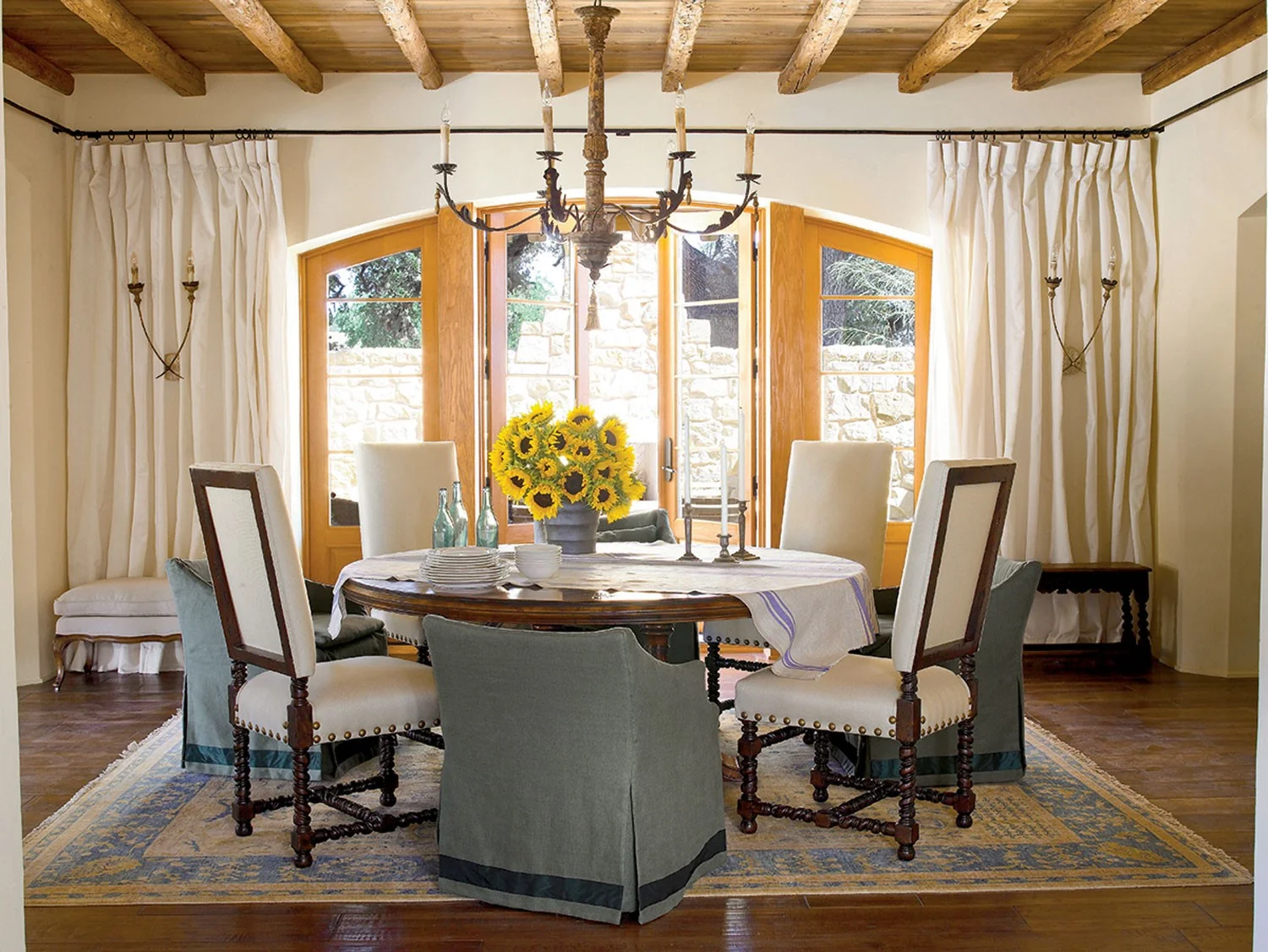
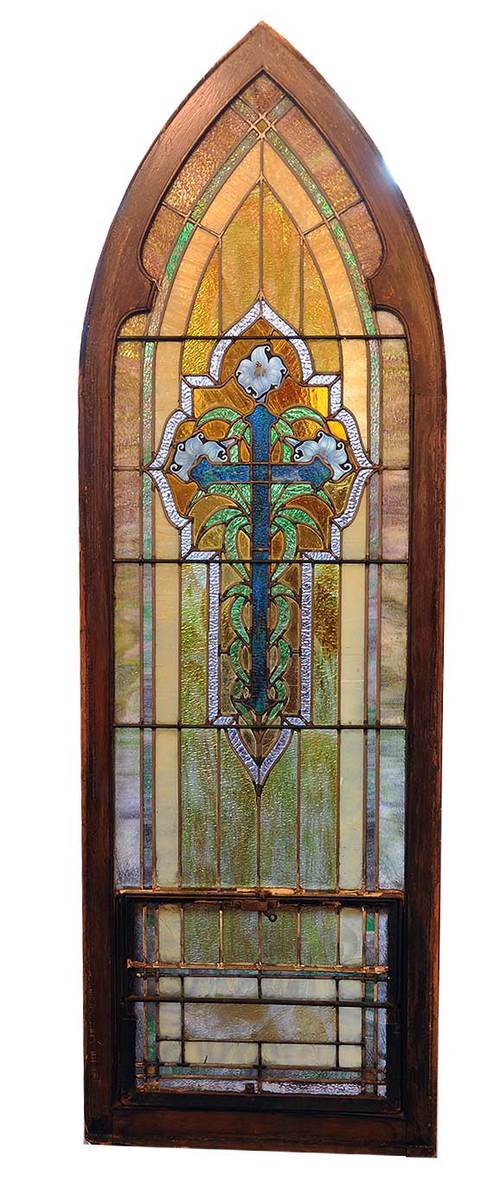
This modern, minimalistic home was once a church. Instead of removing the stained glass windows that appear throughout the structure, Linc Thelen Design designed around them, creating awe-inspiring vignettes. The color scheme for the home reflects the golds and greens seen in the consistent style of the stained glass windows. Their ornate designs, vibrant colors, and bold scale do not detract from the simplicity of the home, but rather add warmth and variation.