Minimalist Color Schemes


In today's design field, less is more. Designers are opting for modest styles, cleaner lines, and fewer distracting decorations. Throughout this trend to simplify interior spaces, designers have also pared down on the number of colors they implement. Most commonly, this means that the color palette includes tints and tones of two or three colors, with occasional accents of another color.

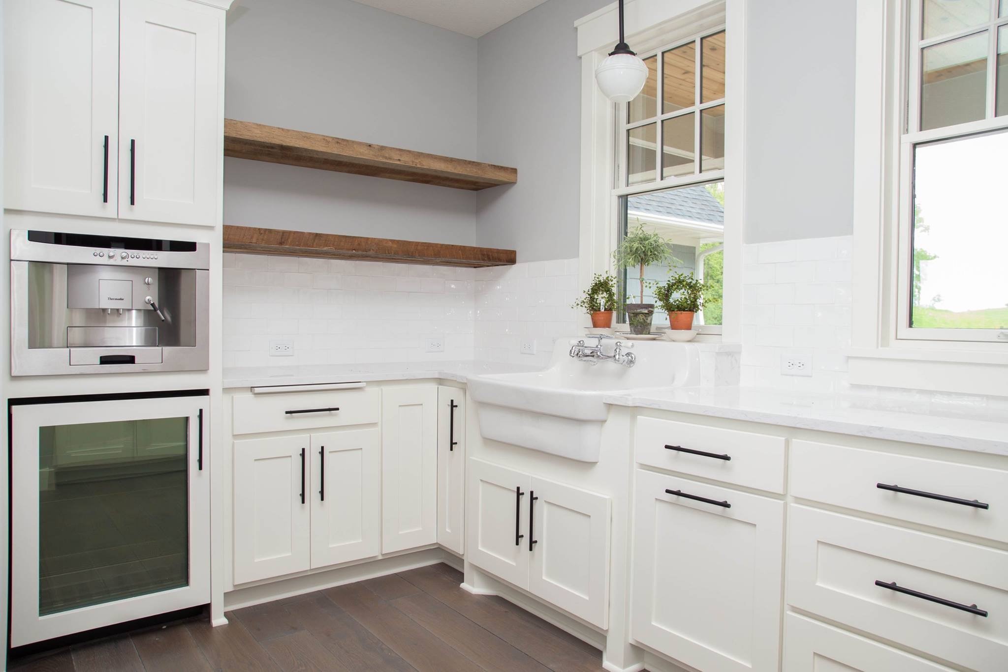
This type of color scheme was recently used by LDK First Impressions, in a kitchen featuring our art deco pendants. The space primarily consists of black, white, and grey, with brown accents. The effect is a simple, yet cozy space for cooking and entertaining.

 
Photos courtesy of Jean Milton

Photos courtesy of Jean Milton


This kitchen is also an excellent example of how antiques can be integrated into modern designs. The pendants fit the color scheme, while their detailing mirrors the fun, patterned back splash.

As a tribute to the minimalist color scheme, we chose three of our light fixtures to serve as inspiration for three different color palettes. We then designed blank rooms, using these light fixtures and our antiques to create unique spaces. Keep reading to see the results!


Whiteout

Untitled design (1).png
 

This little scene could be anything from an urban living area to quaint cafe seating. We pulled colors from our Sixties Rondure Fixtures, coming up with white and grey. While we love the monochromatic tones of our Soap Factory Industrial Pallet and Midcentury Stool, we felt that pops of greenery were necessary to give the space some life. 


Bumblebee


This traditional living room was inspired by our Six-Light Brass and Iron Gothic Chandelier, with its black and yellow form. Our Cast Iron Mantel visually connects the ceiling to the floor with the continuation of black iron. In the corner, our Decorative Privacy Screen brings the black and yellow together, while also making the yellow more prominent. The white Cast Iron Chair Set acts as an accent to the color scheme, offering a contrast to the rest of the pieces.


Toffee


The range of browns, tans, and whites seen in this study space are brought together by the hues in our Brass Sputnik Light. We would imagine this space belonging to a student who resides in a loft, with our Oak Desk and Oak Ladder Back Chair creating the perfect place to take notes, and our Burden Basket acting as aesthetically pleasing and convenient storage. The room is further embellished by our I.P. Frink Illuminated Mirror, and artwork such as our Hand Painted Advertising Window. Each of these pieces coordinates with the color scheme, while introducing its own particular tint or tone through their antique qualities.


How to Find The Right Hanging Height For Your Chandelier


Finding the "right" chandelier for your dining room, kitchen, or living room can be a daunting, time-consuming (but fun!) process. With all the options out there; the different styles, materials, designs, colors... how do you choose?! Well, the first step is to stop by Architectural Antiques in Northeast Minneapolis and have a look through our extensive collection of antique chandeliers and lighting fixtures until, eventually, you find that perfect match for your industrial kitchen or for your Victorian dining room.  

Once you have your unique, one-of-a-kind chandelier from Architectural Antiques, you realize that you do not know exactly where to hang it. How high is too high? How low is too low? Does it depend on the size or the style of the chandelier? All you want is to just get your new fixture properly installed and hanging up as soon as possible so that all of your friends can come over and gawk at your amazing interior design skills.

Don't fret, finding the proper hanging height for your chandelier can be easier than you think, especially if you follow the simple guidelines and suggestions shown in the diagram below, for where to hang your chandelier above your dining room or kitchen table.


Further examples using various lighting pieces currently in our store:

These candle-style chandeliers are great examples of chandeliers that should not be placed too close to the ceiling, as it might look strange from an aesthetic standpoint, and could also be a potential fire hazard. These chandeliers, and ones similar to them, may serve better being hung lower and closer to the table's surface anyways, as their lights are facing up, instead of down towards the table, and therefore can better illuminate the space if hung lower.


These smaller chandeliers are great examples of lighting fixtures that should be hung lower and closer to the table's surface, for various reasons. Because of their smaller size and simple, geometric designs, they can have a greater presence and significant design impact in the room if they are hung lower, instead of hanging up close to the ceiling, where they may not stand out as much. They also can more effectively illuminate the space if hung lower.


Larger, more elaborate chandeliers can be hung higher, and further away from the table's surface.  Due to their large size, dramatic design, bright colors, and overall extravagant presence, they can hang higher and closer to the ceiling as they will still make a significant impact on the room as the main focal point, without overwhelming the space. Also, because of their larger size, they generally have stronger lighting ability, so they can hang higher and still effectively illuminate the space.


Remember: the best way to find the proper hanging height for your light is to test it out and try different options to see what works best for your individual, unique situation!