Architectural Antiques and the Mystery of the Old Crate

typeface.jpg
 

One of the things that we love about antiques is that each nick tells the story of the people who owned it before. When we're lucky enough, the previous owners leave a piece of themselves in the form of handwriting; however, the printed qualities can tell a lot about the time period from which it came too. This crate is a smorgasbord of typefaces with each one containing its own unique story. On this single crate, four different categories of typefaces can be identified: sans serif, script, stenciled serif, and slab serif. Before we dive in, let's go over the definition of each of the terms.

A serif is the line attached to the end of a letter's stroke. We like to think of them as the feet. The stenciled in numbers on the side of the crate as well as the "W.&A. GILBEY" are both examples of a serif typeface. However, they are different types of a serif with different histories. Stenciled type was used in the early 19th century by a small group of English engineers and surveyors to label their technical drawings before becoming more commonly used in the 20th century

The "W.&A. GILBEY" belongs in a subcategory of a serif known as a slab serif. This means that the serif has sharper corners and doesn't transition smoothly into the letter stroke as a regular serif does. The variation of this particular slab serif was designed in the mid-1800s. It's popularity died down in the 1920s until a revival in the 1950s.

Since the type that says "TEN YEARS OLD" doesn't have any serifs (or feet) attached to the letters, it's a san serif. The san serif typeface reached popularity in the early 1900s and reached its peak in the 1920s and 30s. The clarity and legibility from a distance made it popular for display uses.

Lastly, "They Royal" is an example of a script. More specifically, it's an example of a Spenserian script similar to the iconic Coca Cola and Ford logos. Spencerian was the standard cursive script taught in schools from the 1860s to 1920s and was common during this time period.

 Knowing the history of these typefaces can help pinpoint a time period from when the crate, or at the very least the type stamp on the crate, was designed. Taking all of these histories into consideration, a clearer image of the time frame comes to shape. At the very earliest, the stenciled type and script indicate mid-1800s, while the revival of the slab serif suggests 1950s at the latest. Once all of the overlapping time periods are considered, the time frame is narrowed down to the early 1900s.

Now let's compare our estimation with actual facts. W.&A. Gilbey was founded in 1857, which corresponds with the script and stencil. The company gained its stride and started expanding their wares as well as acquiring other businesses in the early 1900s. W.&A. Gilbey merged with United Wine Traders Ltd in 1962 and then changed owners 1972. The detective work was pretty spot on, don't you think?

 

Minimalist Color Schemes


In today's design field, less is more. Designers are opting for modest styles, cleaner lines, and fewer distracting decorations. Throughout this trend to simplify interior spaces, designers have also pared down on the number of colors they implement. Most commonly, this means that the color palette includes tints and tones of two or three colors, with occasional accents of another color.

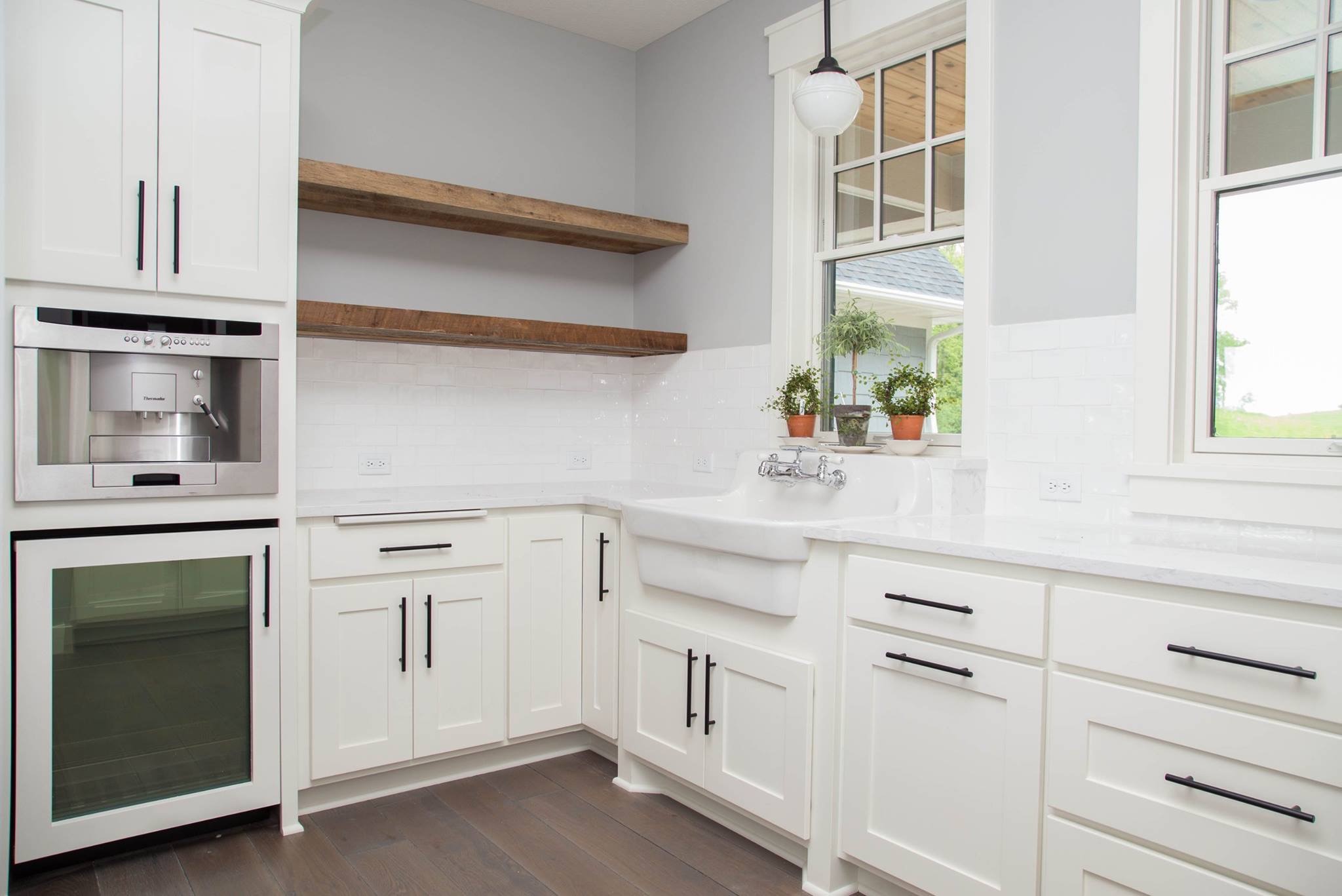
This type of color scheme was recently used by LDK First Impressions, in a kitchen featuring our art deco pendants. The space primarily consists of black, white, and grey, with brown accents. The effect is a simple, yet cozy space for cooking and entertaining.

 
Photos courtesy of Jean Milton

Photos courtesy of Jean Milton


This kitchen is also an excellent example of how antiques can be integrated into modern designs. The pendants fit the color scheme, while their detailing mirrors the fun, patterned back splash.

As a tribute to the minimalist color scheme, we chose three of our light fixtures to serve as inspiration for three different color palettes. We then designed blank rooms, using these light fixtures and our antiques to create unique spaces. Keep reading to see the results!


Whiteout

Untitled design (1).png
 

This little scene could be anything from an urban living area to quaint cafe seating. We pulled colors from our Sixties Rondure Fixtures, coming up with white and grey. While we love the monochromatic tones of our Soap Factory Industrial Pallet and Midcentury Stool, we felt that pops of greenery were necessary to give the space some life. 


Bumblebee


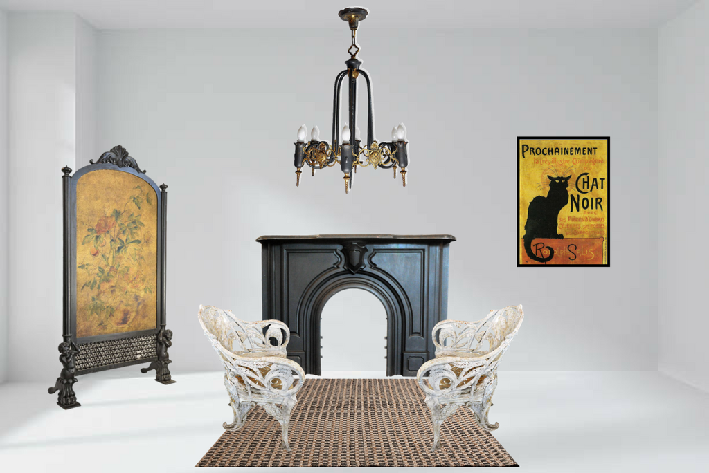
This traditional living room was inspired by our Six-Light Brass and Iron Gothic Chandelier, with its black and yellow form. Our Cast Iron Mantel visually connects the ceiling to the floor with the continuation of black iron. In the corner, our Decorative Privacy Screen brings the black and yellow together, while also making the yellow more prominent. The white Cast Iron Chair Set acts as an accent to the color scheme, offering a contrast to the rest of the pieces.


Toffee


The range of browns, tans, and whites seen in this study space are brought together by the hues in our Brass Sputnik Light. We would imagine this space belonging to a student who resides in a loft, with our Oak Desk and Oak Ladder Back Chair creating the perfect place to take notes, and our Burden Basket acting as aesthetically pleasing and convenient storage. The room is further embellished by our I.P. Frink Illuminated Mirror, and artwork such as our Hand Painted Advertising Window. Each of these pieces coordinates with the color scheme, while introducing its own particular tint or tone through their antique qualities.


Integrating Stained Glass Into Interiors


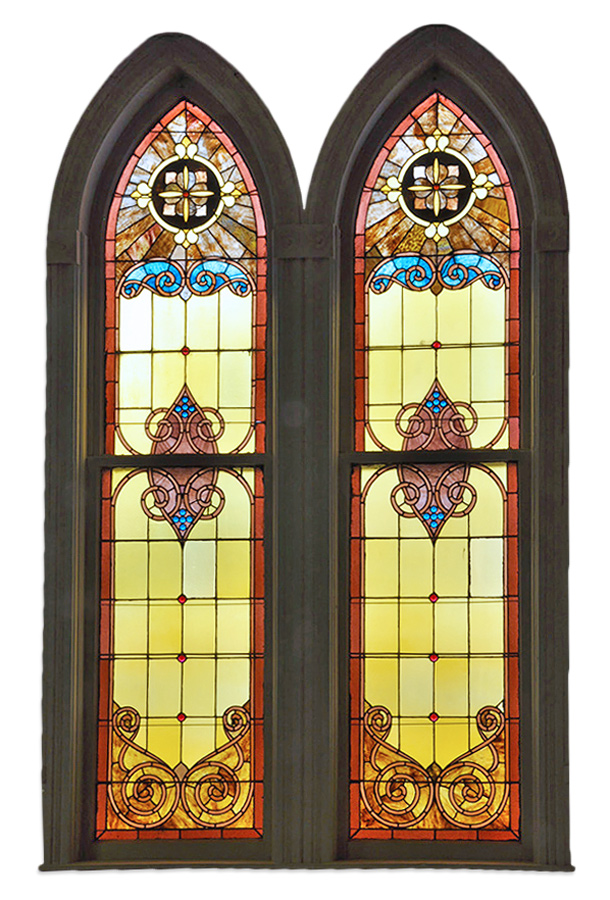
Stained glass began bringing color and light to interior spaces in 7th century AD, and continues to inspire designs to this day. Regardless of interior style, it has been repeatedly used as a focal point, or as a complement to its surrounding decor.

Integrating stained glass into interiors doesn't have to be challenging, but it often appears that way. There is the daunting task of finding a piece that works with your desired color scheme, and of course deciding on a location where the piece will shine – literally and figuratively.

In order to aid you in your stained glass design journey, we have found spaces that effectively added visual interest through stained glass. Check out these three vignettes that prove that any design can benefit from stained glass.


Traditional

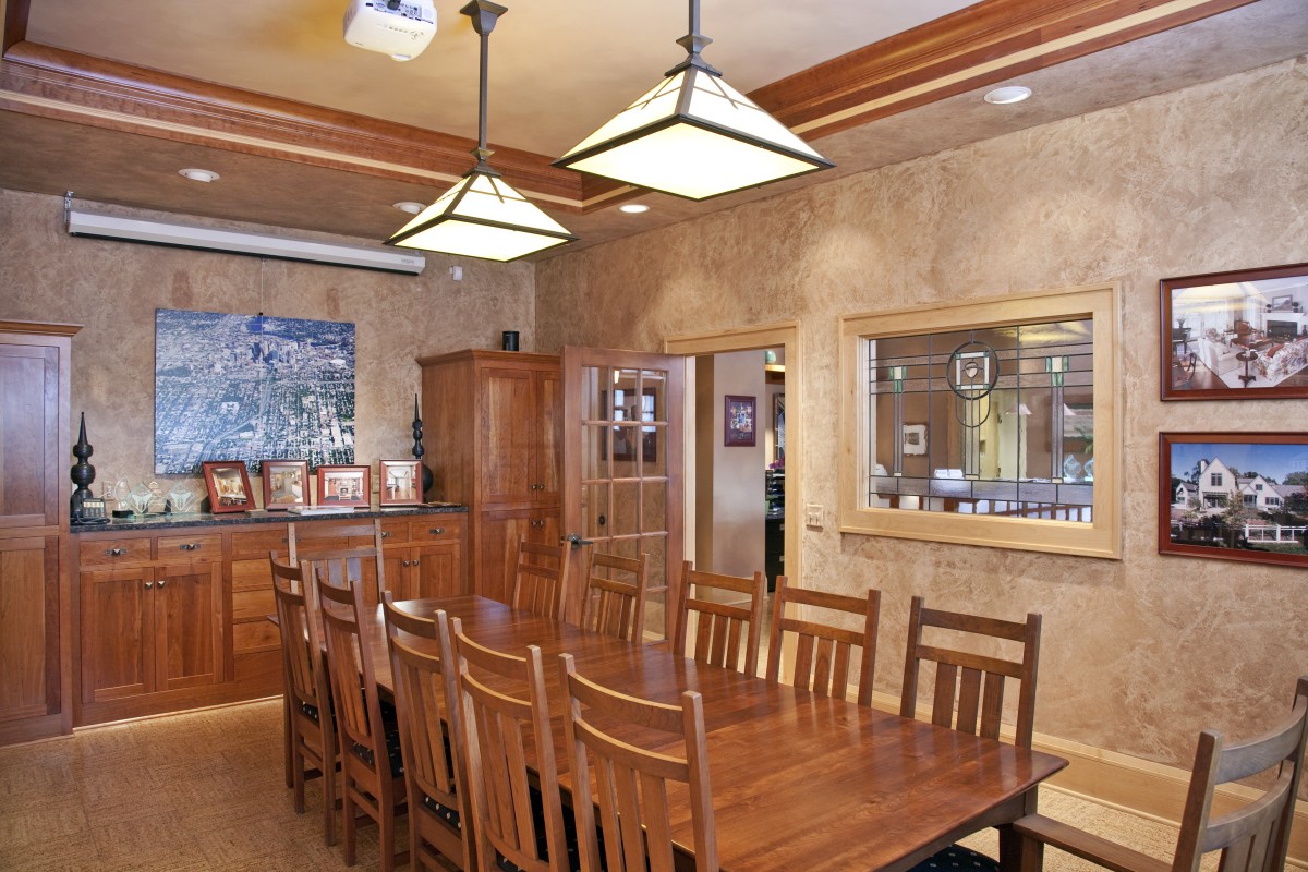
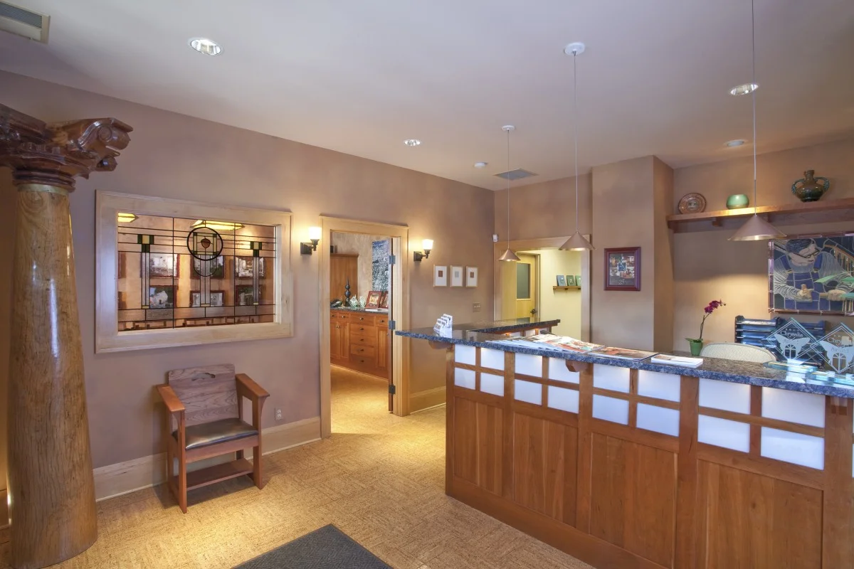
The office of TreHus, an architecture and interior design firm, shows how a stained glass window allows a craftsman-inspired space to stay true to its style, while adding interest and function. The green tones in the window complement the cherry wood used throughout the space, while also adding depth to the neutral color palette. Additionally, the window allows sightlines between the conference room and lobby, without compromising privacy.


Traditional-Modern

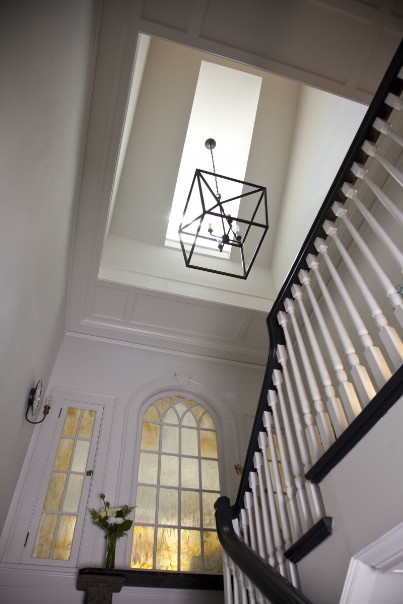
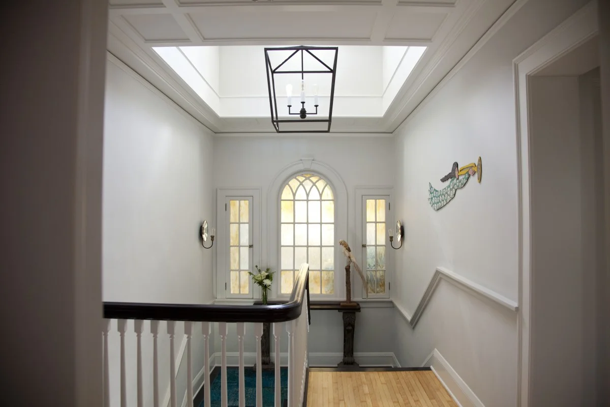
This stairwell combines traditional architecture with a modern color scheme and materials. The gold and muted mint stained glass windows reinforce the traditional architecture, as well as repeating the colors in the flooring and the white trim. This particular integration of stained glass subtly ties together the differing aspects of the design, while still letting light into the space.


Modern

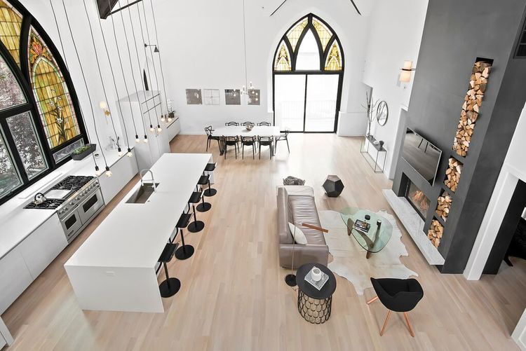
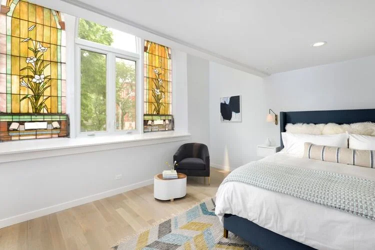
This modern, minimalistic home was once a church. Instead of removing the stained glass windows that appear throughout the structure, Linc Thelen Design designed around them, creating awe-inspiring vignettes. The color scheme for the home reflects the golds and greens seen in the consistent style of the stained glass windows. Their ornate designs, vibrant colors, and bold scale do not detract from the simplicity of the home, but rather add warmth and variation.


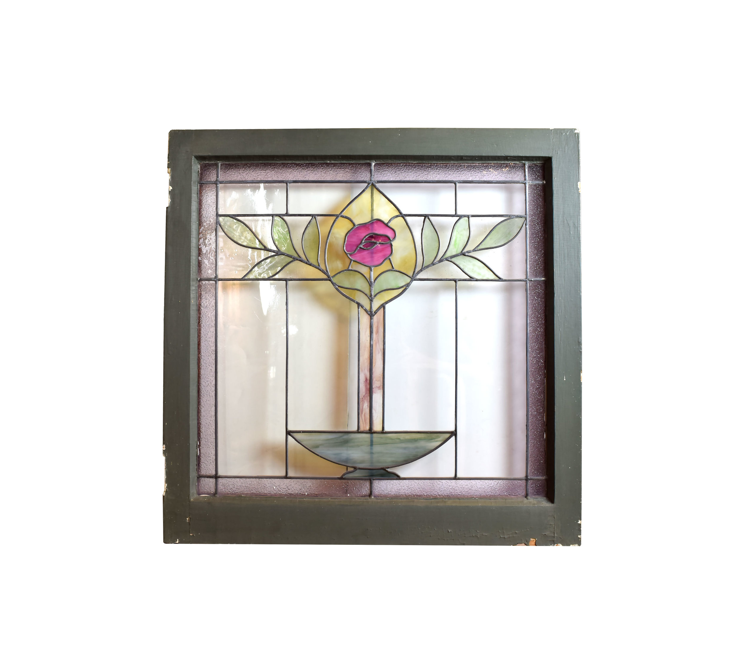
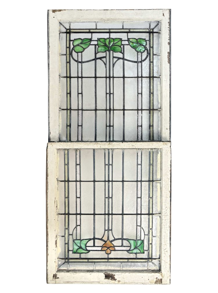
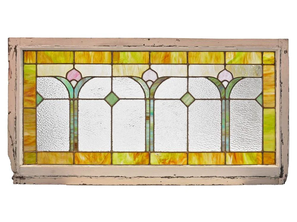
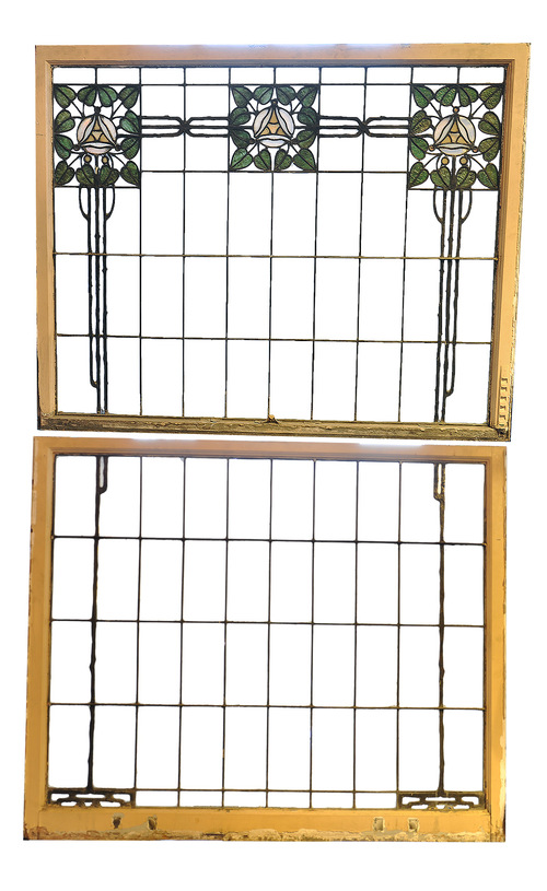
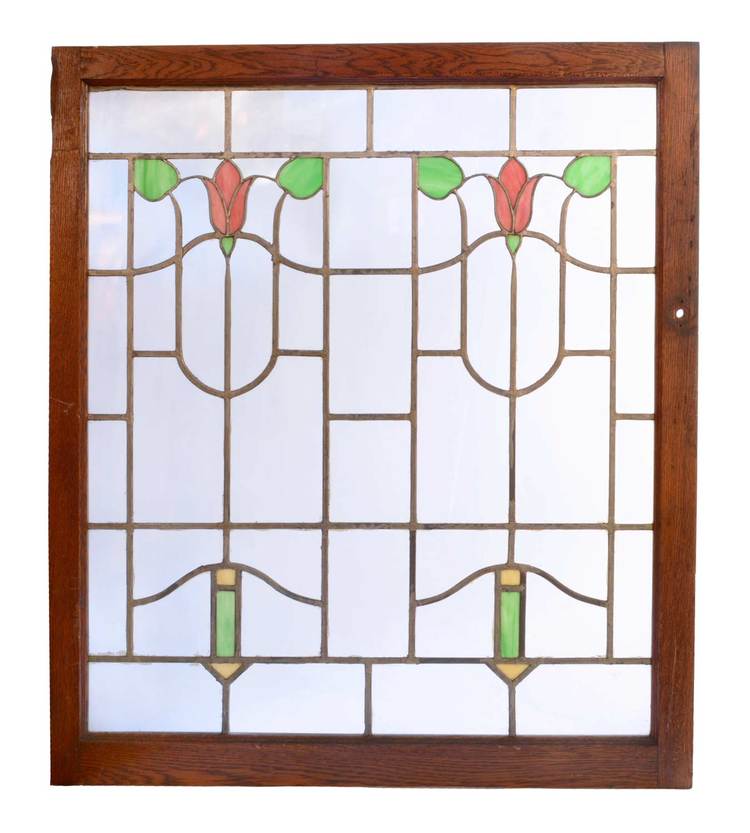
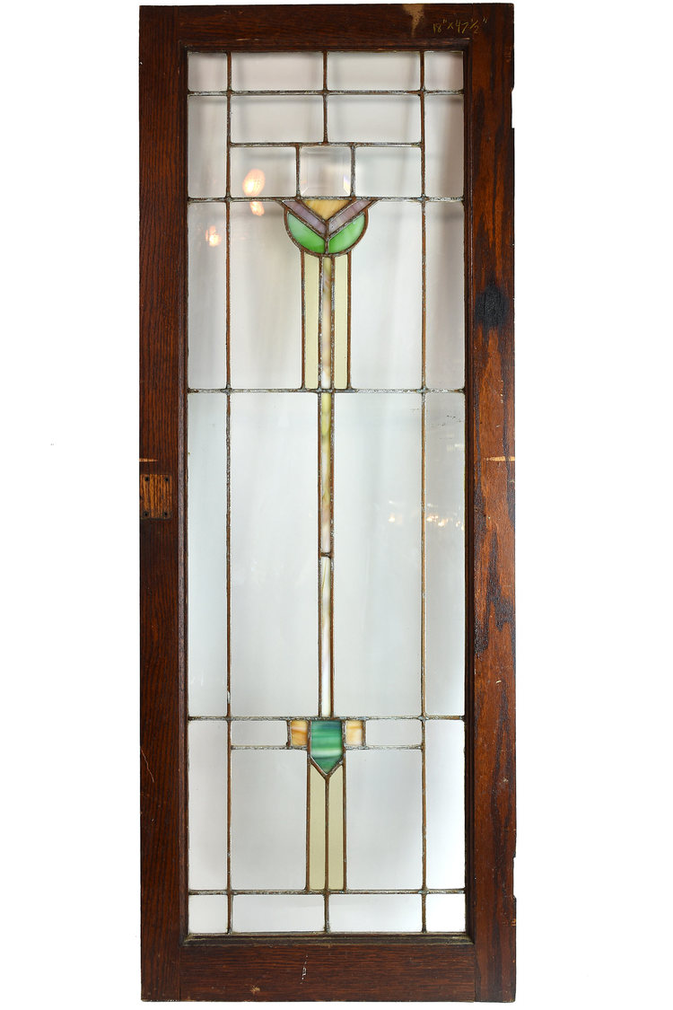
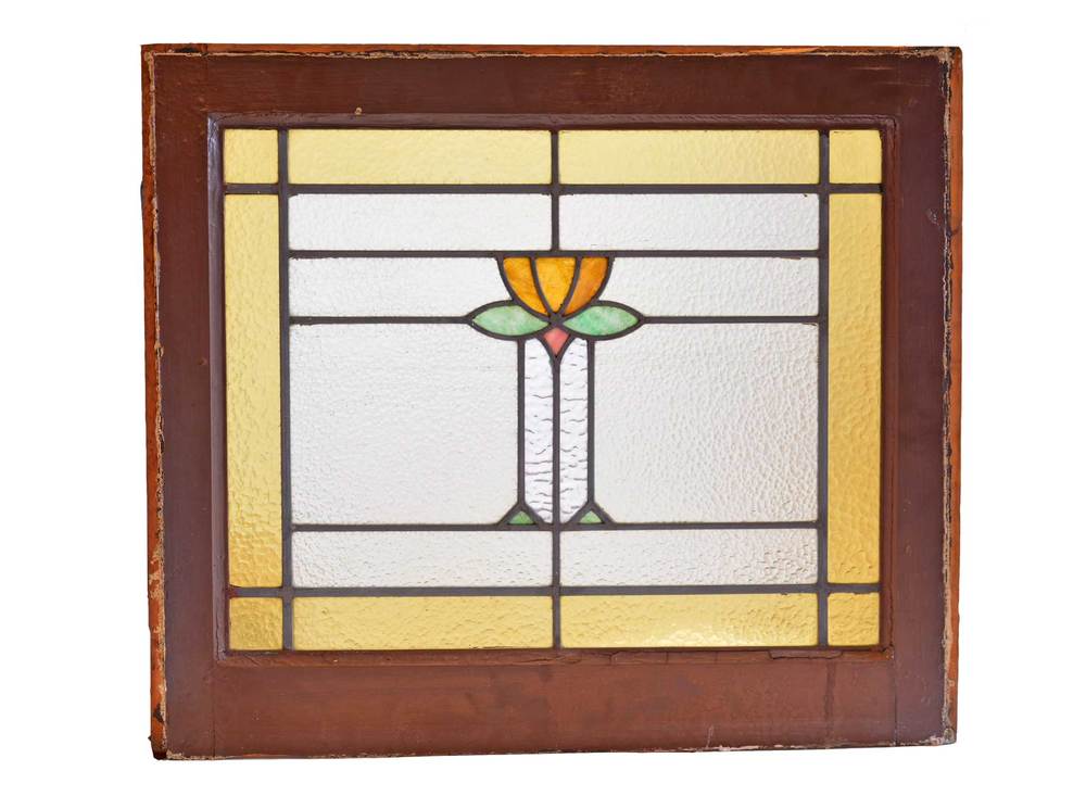
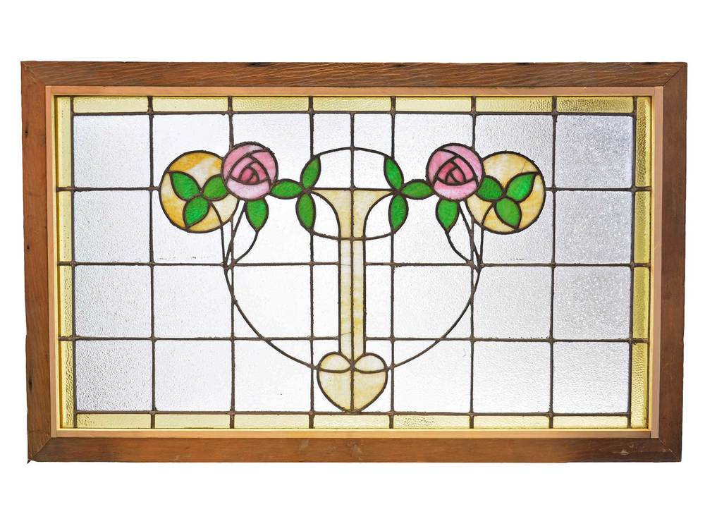
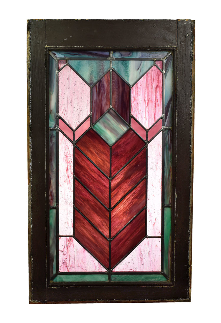
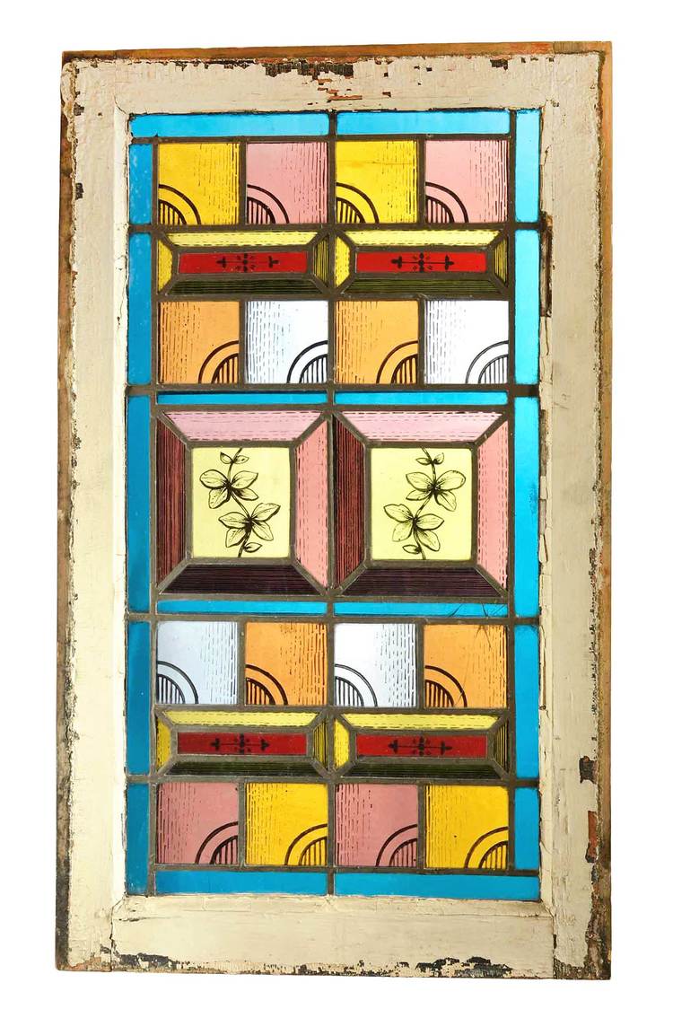
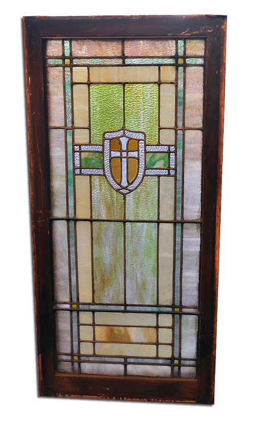
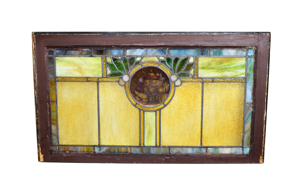
Browse our windows page to find stained glass windows for your space!